
How to Optimize Shopify for Mobile: 11 UX and SEO Fixes to Make Now
Why are Shopify stores still designed primarily for desktop users when mobile shopping represents over half of all retail ecommerce sales worldwide?
In action, desktop-first website design creates bigger problems: slower load times, overcrowded menus, and higher bounce rates that directly hurt your bottom line and visibility in search results.
Below, we'll show you 11 powerful ways to transform your Shopify store's mobile experience, focusing on speed, usability, and conversion optimization that will keep your business a joy to use for every shopper and device.
1. Choose a responsive, mobile-compatible theme
Select a theme that’s built with mobile users in mind and doesn’t just condense desktop layouts. A true mobile-first theme considers load speed, thumb reach, font size, and simplicity.
Here’s a checklist of an excellent mobile-first theme:
- Responsive layout that adjusts to varying screen sizes (from smartphones to tablets)
- Single-column layout for better scanability
- Readable font sizes (minimum 16px body text)
- Sticky navigation or menu that are always accessible
- Larger tap targets for buttons and links (at least 48px)
- Minimal pop-ups or modals that interfere with mobile UX
- Built-in lazy loading
We recommend these free Shopify themes:
- Dawn – A minimalist, image-focused theme that puts your products front and center for mobile users.
- Craft – A clean, authentic layout with spacious design and elegant typography for visual storytelling.
- Sense – A bright, modern theme with curved design elements and robust product detail layouts.
- Studio – A bold theme ideal for creators and curators, featuring colorful accents and artist-friendly navigation.
Once installed, test the theme on multiple mobile devices. Browse your webpages as a shopper would. If anything feels clunky or slow, create modifications or choose a different theme.
Did you know? Lazy loading means only loading images and other content when the user actually needs to see them. This saves data and speeds up your site by showing lightweight placeholders until visitors scroll down to where the full images would appear on screen.
2. Compress all media files
Every extra second your page takes to load can cost you sales, especially on mobile, where users expect instant results.
Before uploading any image to Shopify, resize it to a max width of around 800–1000px and aim to keep the file size under 200 KB. This ensures fast load times without compromising on quality.
File formats also matter. Use WebP for efficiency or JPEG for complex product photos. PNGs should be reserved for transparent elements or text-based graphics.
Use these free image compression tools:
3. Simplify navigation menus
On a small screen, less is more. Keep your top-level navigation simple with no more than five or six menu links like “Shop,” “Collections,” or “Contact.” Use submenus sparingly and only when they genuinely help the user journey.
Sticky navigation bars are especially helpful on mobile. They allow users to access your menu, cart, or search function without needing to scroll back to the top. If you have a large catalog, a visible search icon in the header makes product discovery faster.
4. Improve mobile site speed
According to Google, the best-performing webpages load in around 1.2 seconds.
Some behind-the-scenes cleanup can make a big difference in how fast your Shopify store loads on mobile.
Remove or disable unnecessary Shopify apps, especially ones you’re no longer using. These often add extra JavaScript, which slows down load times. Some examples include pop-up tools, live chat widgets, old analytics tools, or abandoned cart trackers.
You can also minify CSS and JavaScript files, which means removing extra spaces, line breaks, and comments in the code. You don’t need to do this manually. Shopify apps like Thunder Page Speed Optimizer handle this automatically.
When all’s said and done, use Google’s PageSpeed Insights to analyze your website’s current speed.
5. Display product images clearly
When screen space is limited, product photos need to be clean and easy to browse.
In product collection pages, show two products per row. This layout keeps items large enough to tap and view without overwhelming the page. Consider using square or portrait-oriented thumbnails for optimized viewing on smartphones and a polished look.
On individual product pages, aim for three to five high-quality images of the product. Show the item from different angles, and if applicable, include a close-up or lifestyle photo to give shoppers context.
6. Use clear call-to-action buttons
If CTA buttons like “Add to Cart” or “Buy Now” are hard to tap or poorly styled, shoppers may get confused and leave your site.
The World Wide Web Consortium (W3C) recommends a minimum touch target size of 48×48 pixels for mobile buttons. This helps prevent mis-taps and ensures buttons are easy to use for all shoppers, including those with limited dexterity.
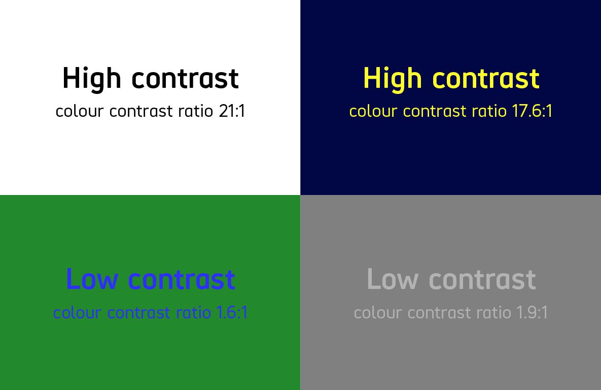
Colors help make your buttons stand out, too. Use high-contrast colors like black text on a white background or white text on a bold color like orange. Avoid low-contrast combinations like light gray text on a white background, which can be hard to read.
Check out WebAIM’s Contrast Checker tool to see how accessible color combinations are.
Finally, avoid vague button labels like “Submit” or “Continue.” These don’t tell users what action they’re taking. Instead, use specific wording like “Place Order,” “Create Account,” or “Proceed to Checkout.” The more context you give, the more confident shoppers will feel.
What not to do with mobile CTAs:
- Use buttons smaller than 48px, which are difficult to tap
- Choose low-contrast color combinations, like light gray on white
- Use vague text like “Submit” instead of clear actions like “Sign Up” or “Add to Cart”
- Hide CTAs far below the fold without a sticky version
- Stack buttons too close together without spacing
7. Format text for readability
Text that’s hard to read on a small screen is one of the fastest ways to lose a potential customer. Use a minimum 16px font size for readability.
Stick to simple, sans-serif fonts like Arial or Helvetica. Use only one or two fonts throughout your site, and avoid ornate styles that can be hard to read on small screens.
Keep paragraphs short (2–3 lines) and use subheadings to organize your content. For longer product details or FAQs, use accordion-style sections so users can expand only what they need.
Common text layout issues and how to fix them:
- Too little negative space → Add padding between text blocks to improve scanability
- Text that’s too large → Adjust to a size that fits comfortably on screen without forcing excessive scrolling
- Full-width text lines → Keep line widths narrower to make reading easier on the eye
- Overuse of bold or caps → Use sparingly to avoid visual fatigue
- Dense paragraphs → Break them up with headings, bulleted lists, or images
8. Avoid intrusive pop-ups
If pop-ups don’t offer value—like a discount or sale—shoppers will close them or bounce altogether. And if there's no obvious way to dismiss them, you’ll likely lose a potential sale.
Make pop-ups a seamless part of your website by timing them based on what shoppers are actually doing. Skip the annoying homepage pop-ups and instead show them when someone's spending time on a product page (like after 10 seconds of browsing). Always make sure there’s a big exit button, so users can easily clear it from their screen.
Did you know? A layout shift happens when elements on the page unexpectedly move around while it's loading. For example, when an image loads late and pushes down text. This creates a frustrating experience for mobile users. To prevent it, set fixed width and height for all images and avoid inserting banners or pop-ups mid-scroll.
9. Optimize the checkout experience
If the checkout process feels overly complicated, shoppers will abandon their carts without a second thought.
An easy way to avoid abandoned checkouts is by making forms as minimal as possible. Eliminate unnecessary fields, and only collect information that’s absolutely required to fulfill the order. Use autofill where possible (like addresses), and make sure form inputs are mobile-friendly. For example, using the numeric keypad for phone numbers and zip codes.
Here’s an example of a mobile-friendly account creation form:
- First name
- Last name
- Email address
- Password
- Create Account button
The form is short and keeps optional fields out of the way. Good mobile checkout design respects your customer’s time, device limitations, and attention span.
10. Use white space and respect scroll behavior
White space—also known as negative space—isn’t wasted space. It helps structure content, improve focus, and make mobile pages feel less cramped. When done well, it reduces visual fatigue and makes it easier for customers to browse your store.
Pages that benefit most from white space include:
- Product collection pages, to avoid decision fatigue
- Checkout forms, to prevent accidental taps or skipped fields
- Menus, to keep navigation from feeling cluttered
- CTAs, to draw attention and avoid visual competition with other elements
- Policy pages, to improve readability and scanability
Also, avoid scroll-jacking—overriding natural scrolling with animations or transitions that interrupt user control. Let users move through your site on their terms, especially on mobile, where intuitive movement is expected.
11. Ensure accessibility across devices
Accessibility means anticipating and supporting the needs of all users—not just meeting standards. It’s about caring for how people use your site in different contexts: on older devices, with slow connections, or with vision, motor, or cognitive challenges.
Not every user has high-speed internet or the latest phone. Sites that assume they do often exclude people unnecessarily. The W3C’s Accessibility, Usability, and Inclusion document highlights this clearly.
To build a truly accessible mobile experience:
- Add descriptive alt text to all images so screen readers can interpret them
- Use high-contrast colors for text and buttons to aid visibility
- Make buttons and touch targets large enough to tap comfortably
- Structure content so it can be navigated with a keyboard or assistive device
- Avoid relying on color alone to communicate meaning (e.g., red text for errors instead of red text and an asterisk)
The bottom line: Mobile optimization is inclusive design
At its core, optimizing your Shopify store for mobile is about building an accessible, inclusive experience. Your store should work for everyone, regardless of their device, internet speed, or physical ability. When you design with those needs in mind, you improve trust and ultimately create a shopping experience that more people can say yes to.
Be part of a growing community


